Archive
Correlation vs. causation: a housing perspective
It is a well known fact in economics that statistical correlation does not imply causation. If in the data two variable increase or decrease approximately at the same time then correlation is positive and if they go in the opposite directions approximately at the same, correlation is negative.
Probably the most common example of significant correlation that does not say anything about causality is positive correlation between wage and education in the data. One person can say that people get higher wages because they know a lot and it benefits them when they are hired. Another person can say that higher wages allow people to get better education. And both would be right. However, there can be a third person who would look even deeper into the problem and say that there is another factor that influences both previous ones such as IQ or inborn smartness. It is easier for a person who is smart to learn (for this reason we might see higher education levels). At the same time employers might not care about education per se, but about how smart you are and how much you can contribute to the company. See the graph below (please forgive my drawing skills).

Causal relationships in the example
OK, so where is the problem? The problem is that the data on how smart people are is not available. Moreover, it is very hard to measure and involves measurement errors that would equally screw the results. This is what the largest oval is about – we observe what is inside it but we do not observe what is outside it, in this example – data on IQ. The part of the graph outside the largest oval is part of the theory behind the relationship between wage and education. In fact, the third guy’s statement is the most difficult to come up with. It is always easier to think in terms of variables that you already have in the data, but IQ data is not a part of it. Definitely, the theory between wage and education without IQ would not be complete and it is possible to end up with a wrong result.
Great, but how is it related to housing problems? In one of my previous posts I posted two pictures: interstate mobility declines over 2005-2006 and drops by approximately 35% (pic). At the same time volatility of unemployment increases a lot in 2008 (another pic from the same post). Here is a new picture that depicts correlation between unemployment rates across states and number of houses that are “underwater” (Value of your house is less than you owe for it in loans). Sources are BLS (for unemployment rates) and CoreLogic (for equity reports).

Unemployment rates vs. share of houses "underwater" by state
Nevada has 62.6% houses underwater in the first quarter of 2011 and 12.9% unemployment rate…So it means that if we delay foreclosures on those houses we increase unemployment in this state relative to others by for example reducing labor mobility? Right? Former governor of CA got an answer ( youtube video with sound). Not quite, even if there was a real decline in labor mobility in the states with a lot of people underwater that won’t mean that one caused the other. It might not be foreclosure delays per se that lock people in their house and thus they should not be implemented. Moreover, the HARP intervention was poorly designed and resulted in high redefault rates. But this information is not in the data, it is “the third guy’s logic”.
Housing problems: what could have been done better.
First of all, some history of what has already been done. Consider the following example : suppose you borrow 100$ from a bank for 2 years to buy a house. The APR is 10%. If it is a mortgage then if you don’t pay, the bank gets your house (this is what is called foreclosure). Suppose you make a payment of 50$ in the end of the first year and the rest of the debt in the end of the second year. Then evolution of payments looks like that:
| Time period | House price | Debt before the payment | Payment | Debt outstanding | Equity |
| Year 0 | 100 | 100 | 0 | 100 | 0 |
| Year 1 | 150 | 110 | 50 | 60 | 90 |
| Year 2 | 150 | 66 | 66 | 0 | 150 |
If house price evolves in the way it is described in the table, you end up with equity equal to $150.” Shareholder’s equity” is the difference between your assets (the house) and liabilities (the mortgage).
Now suppose things don’t go that well and the evolution of house’ s price is different
| Time period | House price | Debt before the payment | Payment | Debt outstanding | Equity |
| Year 0 | 100 | 100 | 0 | 100 | 0 |
| Year 1 | 50 | 110 | 50 | 60 | -10 |
| Year 2 | 50 | 66 | ? | ? | ? |
Now suppose that things don’t go that well and the house’s price decreased, instead of increased, say to 50$. Well, in this case your equity in the end of the year 1 is negative. This is called being underwater. Would you be willing to pay the bank even 60$ if you had these 60$ in the end of year 1? Maybe, but you would probably think twice. As soon as you equity becomes negative, having mortgage is like paying expensive rent for the house.
What can the bank or government do in this situation and what was actually done?
- Decrease the interest on the loan? Would it work? No, just because your equity is already negative in the end of the first year. If the bank says that the APR is now 5% it wont make any difference because it still not worth it paying the mortgage in the end of year 1. But this is what 70% of voluntary modifications were about – missing payments and fees were added at the end of year 1 making the equity even more negative and less attractive for homeowners. So it should be no surprise that the number of foreclosure has actually increased not decreased and people ended up even deeper underwater.
- Would it make a difference if the bank decreases the amount of the principal (the 60$ at the end of year 1)? Yes, because your equity becomes positive and it is profitable for homeowners to keep paying. There are programs out there that advocate for this.
Why did not this happen? Because banks would have lost money! Moreover, some people might stop paying just because they think their principal would be reduced. Another potential problem: second liens. Second lien is a loan that was borrowed against shareholder’s equity. So the problem is that even if the principal is reduced the homeowners would still be underwater, because the injected money would just be a gift to the servicers of the second liens.
- Government can buy mortgages from the banks for a discounted price (most of the morgages are valued from 30 to 50 cents per dollar and most second liens several cents per dollar) and then reduce principals to make loans affordable to consumers and then when the homeowners are back on track sell the motgages to the banks potentially for a slight profit. Problem: banks might not be willing to sell mortgages for a discounted price simply because they know the government would want to buy them.
- Government can legally take over mortgages using so called “eminent domain”. This method is used when a new freeway needs to be built in some area or the area is contaminated and needs to be demolished. Basically the government tells the banks that they the houses belong to the government and the banks get market price for it. Of course, not all mortgages should be acquired – only owner-occupied. No Congress approval is needed for this action. The money from allocated for the previous (unsuccessful) modification program – HARP – can be used. Too harsh? Not democratic? Well, it was a democrat congressman who suggested it. A similar program was run by FDR in the 1930s. Moreover, the banks generally already have been treated too nice by the government since the beginning of the recession. This action will also encourage other banks to modify the mortgages they own if they want to keep them.
General problem with loan modifications: mortgage back securities, sometimes called “toxic assets” that many investors have. What are they? The picture below should help:

In fact, many banks do not own the mortgages themselves. They resold them to companies like Fannie Mae and Freddie Mac, who pooled the loans in several pools depending on how likely people that own the money are likely to repay the mortgages. After that these pools were split in securities (like “shares” of the pools) and sold to different investors. This process is called “securitization”. Investors were supposed to be paid when people pay their mortgages. Further, there exist financial derivatives (stocks that depend) on these MBS such as credit default swaps (CDS) that pay if a person defaults on his mortgage. In other words, default on the mortgages is profitable for the owners of CDS on them (you don’t have to even own the mortgage to own a CDS on it). So any action by the government would benefit some people and hurt others, so as Adam Levitin put it
the government needs to settle on its policy goal. Why are we trying to prevent foreclosures? Is it a macroeconomic goal of stabilizing the housing market? Is it a macroeconomic goal of deleveraging consumer balance sheets? Is it a moral goal of helping unfortunates? Is it an electoral goal of making people feel that the government is doing something/is on their side?
And then do something, not just say everything is alright. Because 9% unemployment for 3 years is not alright, even if fundamentals are fine.
Recession indicators
Everyone is worried about whether a double dip recession is on the way. Google search for “double dip recession” gives millions of results with fresh articles and posts in most major media websites : MSNBC, NY Times, USA today, WSJ and others. Many media are being very pessimistic about it, claiming that the economy has already entered another recession, other caution that it is possible. For these reasons, I decided to review several recession indicators used by economists. These are not the same than those usually mentioned in the media. t. Quick answer to the question whether we are in another recession is : nobody knows and simply cannot say for sure. Why? Read on.
First of all what is a recession? According to NBER, the organization who actually determines whether we are in the recession or not:
A recession is a period between a peak and a trough, and an expansion is a period between a trough and a peak. During a recession, a significant decline in economic activity spreads across the economy and can last from a few months to more than a year. Similarly, during an expansion, economic activity rises substantially, spreads across the economy, and usually lasts for several years.
Keywords in this definition are “significant” and “decline”. In other words, during recession economic activity should be declining, not just stay on the same level. Also, this decline should be significant according to NBER committee. So why cannot we say whether we are heading into a recession or not now?
- New monthly data calculated by NBER and used to determine whether the economy is in the recession is very noisy. Numbers often get revised later. For example, some economists who use econometric methods to forecast future values of GDP found that using the last observation when it becomes available makes the prediction for the future periods worse. For this reason NBER usually waits 6 to 21 months. For example, the committee determined that there was the peak in 2007 11 months after it had occurred.
- Only if many indicators reach a peak, NBER declares that this was a peak. Same happens with troughs. Looking on one indicator, such as GDP or the unemployment rate, is not enough.
OK, that is good, but what if somebody does not want to wait a year or more for NBER finally announcing that there actually was a recession today? NBER uses the following list of indicators (xls source for this information with some data):
Quaterly Data
- GDP, NIPA table 1.1.6
- GDI, NIPA Table 1.7.6 (“I” stands for income)
Source for this data is here
Monthly Data
- Macro Advisers historical monthly real GDP (xls source)
- New Stock-Watson index of monthly GDP (source)
- New Stock-Watson index of monthly GDI (source)
- Real manufacturing and trade sales (SIC befor ’97, NAIC after ’97. NIPA Detailed Tables 2AU and 2BU)
- Index of industrial production (source)
- Real personal income less transfers (NIPA Table 2.6, see source for quarterly data)
- Aggregate weekly hours index in total private industries (source)
- Payroll survey employment (source)
- Household survey employment (source)
Interpretation of all these indicators is straight-forward: if it goes down, the economy is not doing well and if it goes up things are great. All of the source websites present you with the graphs with adjustable time periods. Comparing todays values with the values during past recessions one can see what kind of contraction/expansion in each variable NBER considers significant and makes corresponding conclusion
So what do we see in this data? Seems like nothing bad is going on for now and there is no reasons to panic. Yay! However, if one looks at the growth rates of these variables, you can measure how well the economy recovers. The general answer is that the recovery has slowed down. While there is still no reason to panic, because it might be just noise or it will accelerate soon, it is a warning sign .
But what about other indicators often used by media, such as unemployment rate? Aren’t they indicators of economic activity? Yes and no. They have their own peculiarities and have to be used with caution. For example, quoting NBER, unemployment rate
…often rises before the peak of economic activity, when activity is still rising but below its normal trend rate of increase. Thus, the unemployment rate is often a leading indicator of the business-cycle peak. … On the other hand, the unemployment rate often continues to rise after activity has reached its trough. In this respect, the unemployment rate is a lagging indicator.
Other indicators used include inventories, auto sales, and housing are not currently declining but are still at very low levels relative to the pre-recession period.
And finally, for the dessert, some very interesting high-frequency indicators (because they are not so well-known one has to create graphs him-/herself ) that are available to anyone. The description is available in this post by Rebecca Wilder and the graphs with the recent data is available in this post which I am using here as well. These indicators are
- Weekly initial unemployment claims (These series are not used by NBER due to a lot of noise in it. Rebecca Wilder suggests using 4-week moving average of seasonally adjusted initial claims or its growth rate). For now these series look like that:
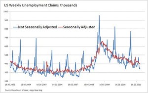
Rebecca’s comments about this graph:
Claims are elevated but ticked up last week. If claims do not fall back in coming weeks, the unemployment rate will rise again. This could indicate the outset of a contracting economy.
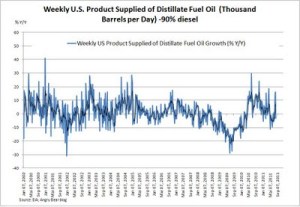
- The US Energy Information Administration’s weekly estimates of distillate fuel oil supplied to the end user in thousands of barrels per day (real) (This data is not seasonally adjusted. It works as an indicator for domestic demand for goods that are transported across the country). For now it looks like this data shows an increase.
- And the last Rebecca’s indicator is daily Treasury tax receipts that are slowing but growth remains positive

There are other series that are used in media but do not serve as indicators of recession for the US economy. These series include government debt (high levels of government debt do not mean we are in a recession, as long as people believe that it will be repaid. Demand for US bonds is not decreasing!) , inflation (Currently the Fed does not want prices to decrease, not increase! Rising prices for cotton probably mean that the demand for cotton went up. Moreover, inflation would erode government debt which is also a good thing for the US) .
To sum up, it does not seem like we are heading into another recession for now, but there are several signs that the recovery has slowed down.
In any case, in the current situation government has to do something to get the economy from the terrible situation in which we are now. Of course, if aliens do not suddenly attack the United States.
Unemployment, mobility and foreclosures
 Kyle posted a very interesting picture not a long time ago (see above) according to which there is a clear increase in the variance of the variance across states in 2008-2011 that coincided with the the Great Recessions. So why don’t the unemployed workers move from the most troublesome states such as California, Nevada, Arizona to the East, where job prospectives seem to look more promising? It seems like moving to a different state is very costly for the workers that the variance in the unemployment rate does not converge to its 2001-2008 level. Presumably a decrease happened somewhere between 2005 and 2008, because pre-2005 spike and after-2005 levels of the variance are essentially the same. The question is that whether foreclosure delay explain this lack of mobility?
There are two main points that I wanted to make here. One is one is my own that I have not seen mentioned anywhere (yet?) and the other one is a summary of the existing evidence on the problem.
In the ongoing debate about whether the unemployment rate for the most is structural (supply side caused, skill/education mismatch) or cyclical (demand side caused, lack of aggregate demand) no consensus has been reached, but many people tend to believe that the demand explanation is more likely (see below).
However, suppose for a second that supply side does explain a portion of the unemployment rate. Then it is probably those construction workers in California, Nevada etc. that do not want to move to the East are causing the large spread in the unemployment rate across states- most of the “structural” unemployment is usually attributed to the lost jobs in construction industry and financial services. I say “want” instead of “cannot” because if “structural unemployment” theory does explain high unemployment rate, it would be equally hard for those workers to find a job in the East. SO they just stay where they had their last job – in the states that experienced the housing boom and where the unemployment rate is the highest in the country. In this case the graph above might have nothing to do with interstate mobility, but just reflect the difference in “structural unemployment” rates.
Moving on to the second part of my post, Mike Konczal posted the following picture on mobility that comes from Census:

As Mike points out
The quick read was that everyone, post bubble-popping, was abandoning their properties and moving across the town to live with their parents and friends while looking for a new local job to save their house, a house they couldn’t sell because they were underwater.
However, as he later points out, the paper by Greg Kaplan from Minneapolis Fed Interstate Migration Has Fallen Less Than You Think: Consequences of Hot Deck Imputation in the Current Population Survey says that
…much of the recent reported decrease in interstate migration is a statistical artifact. Before 2006, the Census Bureau’s imputation procedure for dealing with missing data inflated the estimated interstate migration rate. An undocumented change in the procedure corrected the problem starting in 2006, thus reducing the estimated migration rate. The change in imputation procedures explains 90 percent of the reported decrease in interstate migration between 2005 and 2006, and 42 percent of the decrease between 2000 (the recent high-water mark) and 2010. After we remove the effect of the change in procedures, we find that the annual interstate migration rate follows a smooth downward trend from 1996 to 2010. Contrary to popular belief, the 2007–2009 recession is not associated with any additional decrease in interstate migration relative to trend.
Which probably means that housing boom and subsequent number of foreclosures has nothing to do with the decline in workers interstate mobility. Another piece of evidence is the paper by Colleen Donovan and Calvin Schnure “Locked in the House: Do Underwater Mortgages Reduce Labor Market Mobility?” and its summary that originally belongs to Kash Mansori. The main question was whether the fall in house prices since 2007 in the US created a lock-in effect that depressed labor mobility. The paper finds that even though
the evidence presented in the paper indicates that the fall in house prices has indeed caused a “lock-in” effect, but has not significantly impacted labor market efficiency.
and even more
The lock-in, however, results almost entirely from a decline in within-county moves. As local moves are generally within the same geographic job market, this decline is not likely to affect labor market matching. In contrast, moves out-of-state, which are more likely to be in response to new employment opportunities, show no decline, and in fact are higher in counties with greater house price declines
which together with the previous evidence reasserts the fact that the foreclosure rates did not significantly affect labor mobility.
[Update: Aug 20 1:30pm]
Kyle posted a reply to my post. However, there is no difference between Bob Hall’s graph (Figure 1) and the one I posted – the drop on both graphs happened in 2005 and is the size is the same – approximately 35%! I think there was no drop in labor market mobility due to the foreclosure issues. There was no drop at all! It is just an artifact in calculating procedure as I mentioned in the post and the paper I mentioned.
Clarification about my point about construction workers: I did not mean only construction workers, but all workers who are considered to be “structurally” unemployed: construction, financial services, etc. Even if those people do not contribute to the national unemployment rate, they might contribute to the variance of the unemployment rates across states – just because there are more construction workers in the states where was housing boom.
